Influencing Mood With Color & Texture
Words: Sarah Lograsso
Words: Sarah Lograsso, Director of Marketing and Portfolio Management
Photos: Cultured Stone
Sponsored By

When your client envisions their idea of a perfectly styled space, what do you think comes to mind? Perhaps they’re looking to create a coastal-inspired getaway or a sleek, sophisticated modern space perfectly curated to host cocktail hours. Conceptualizing this ideal space feels attainable to them because it lives large in their dreams, but it’s only going to turn out as good as we make it. In transforming their visions into reality, it’s our responsibility to ensure that the finished space doesn’t wind up feeling off or like it missed the mark in any way.
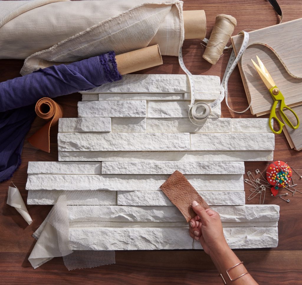
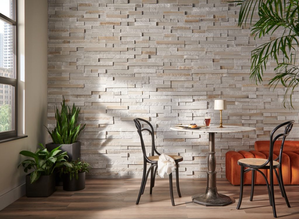 Pictured: Ethos Pro-Fit® Terrain™ Ledgestone, courtesy of Cultured Stone
Homes are intimate spaces, and commercial spaces are where so many of us spend the majority of our waking hours. This means the elements we choose to shape and style them bear the ability to influence the way people feel when they enter a room. With this in mind, it is important to make sure we’re selecting the best architectural and design details to suit each project, paying attention to every nuance of our materials. This certainly includes the broad, overarching look and feel of a space, encompassing a variety of surfaces, fixtures and other materials. It also means we should carefully examine each individual element within that space to make sure the client’s vision has been represented in every detail.
One of the best and most effective exercises for any project is to consider how each specified material is going to contribute to the aesthetic and ambiance of that space. From a masonry perspective, how will our contribution influence people’s perception when they occupy the space? How will our application work in harmony with the architecture of the space and the other materials that shape it? What sort of an impact are we looking to make on the people who inhabit each space, presumably over the span of many years?
Color and texture always have a direct influence on mood, emotion, and even energy levels, whether people are consciously aware of it or not. When used intentionally, these details can be applied throughout the home to express the client’s personal style and speak to the senses on a deep psychological level.
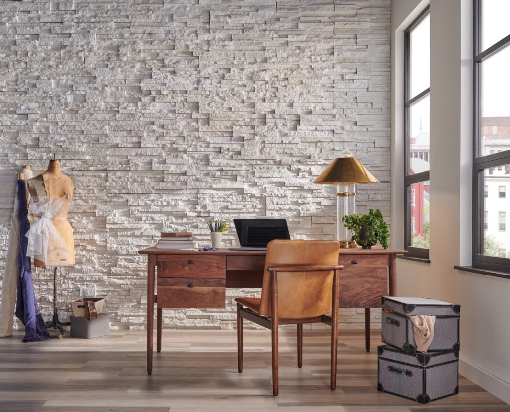 Pictured: Winterhaven™ Pro-Fit® Alpine Ledgestone, courtesy of Cultured Stone
Color Creates a Mood
Much like the ebb and flow of life itself, the resonance we feel with certain colors can change and evolve over time, and we’re always on the outlook for fresh pops to boost our moods. When you’re working with a client, particularly in the initiation phase of a new project, a great place to start is to identify the color palette that best fits their lifestyle and achieves what they want from an aesthetic perspective.
Thanks to what we know regarding color theory, the shades and hues we choose to incorporate in our homes and businesses can prompt a number of different psychological responses. And perception of color is highly personal, so pay close attention to how clients respond to certain colorways. While bright hues of red and orange might be invigorating to some, these same shades may cause others to feel anxious and overstimulated.
For a more calm and serene space, you may find that your clients gravitate towards nature-inspired shades of greens and blues, or perhaps earth-toned neutrals that tend to be warm and welcoming. In contrast, deep dark shades of greys, purples, and even black are often associated with a sense of mystique and might speak to their senses on a deeper level.
Pay close attention to the color palettes they naturally gravitate to and then trust your own expertise and intuition when it comes to finding the right products and application recommendations to match what they’re looking for.
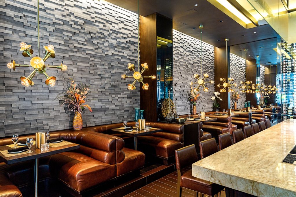 Pictured: Carbon Pro-Fit® Modera™ Ledgestone, courtesy of Cultured Stone
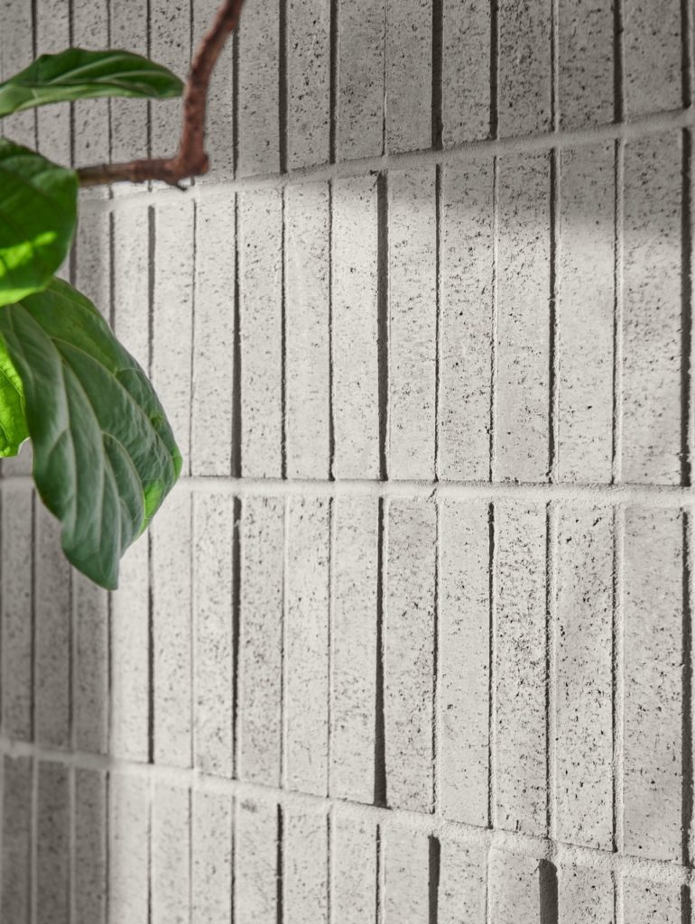 Pictured: Wildon™ Tenley Brick™, courtesy of Cultured Stone
 Tone-Setting Texture
By incorporating tactile diversity into the architecture and design of a project, you can give any space a refined, finished look. This is something we know pretty well, but it’s something you might find yourself advocating for when working with other members of the design-build team or while speaking with a client directly.
Just like color, texture evokes certain feelings and engages the senses by adding visual depth to a space. This sense of depth adds dimension and expands people’s mental engagement with the physical spaces they inhabit. Even in a commercial setting, by enhancing the textural elements in a space we’re helping the occupants’ minds to settle a bit into an overarching sense of comfort and feeling more at home. And it typically doesn’t take long to introduce a few great, textural adjustments, starting with what we put on the walls.
Activate the Senses
Personally, I don’t think there’s anything that compares to masonry materials when it comes to infusing textural touches and mood-setting color into a space. Stone and brick enhance everything about a project, from obvious attributes such as curb appeal to its ability to provide visual depth and a sense of calmness and centeredness from an emotional standpoint. Even when you don’t literally touch the wall, a masonry application has an undeniable, multisensory impact and appeal.
Stone and brick products also contribute to the biophilic design of a space, which reinforces our connections to the natural world and has been proven to boost people’s moods while working at the office or lounging at home. In combination with natural light and other elements that help to “bring the outdoors in,” masonry materials can leave a lasting impression that keeps us engaged in the physical world with all of our senses, even in environments that are becoming more and more reliant on screens and technology.
 Pictured: Winterhaven™ Pro-Fit® Alpine Ledgestone, courtesy of Cultured Stone
From a design perspective, masonry delivers color you can feel just by looking at it. Or, as a designer recently mentioned during a trade show conversation, “The eye sees texture as color.” This means that our reaction to a monochromatic yet textured wall is going to be different than a flat wall with the same monochromatic properties. And that’s saying nothing about the use of products that go further by offered layered colorways with undertones, overtones and unique features that help to orchestrate the play of light and shadow across the textured surface of the stone.
Ultimately, clients are relying on us to help set the tone for every project, not simply in terms of logistics and schedules but also throughout the specification and application process. They’re going to live in or otherwise inhabit these spaces for years to come, and we want them to be happy with the results for the long run.
About The Author
As Director of Marketing and Portfolio Management for Westlake Royal Stone Solutions, Sarah has successfully coupled her design talents with business acumen to refresh, refine and distinctly position five standout brands in the North American market and abroad. She continues to provide design direction for the brands’ variety of best-selling modern profiles and trend-forward color palettes while enhancing the prestige of the category among masons, builders, designers, architects and consumers.